

be part, become whole
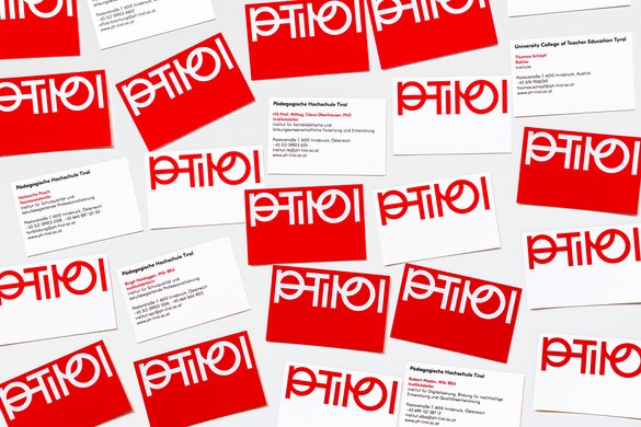
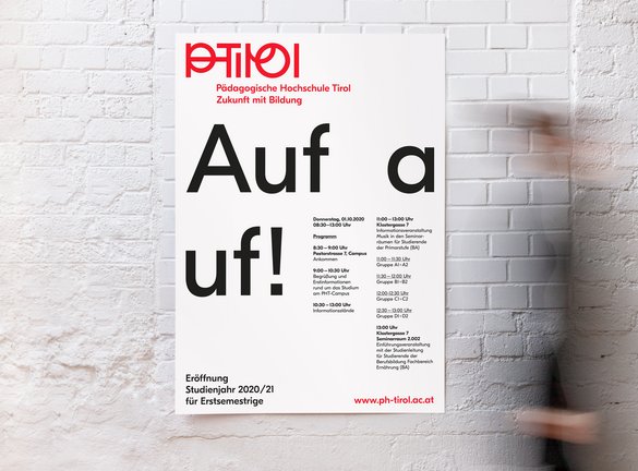
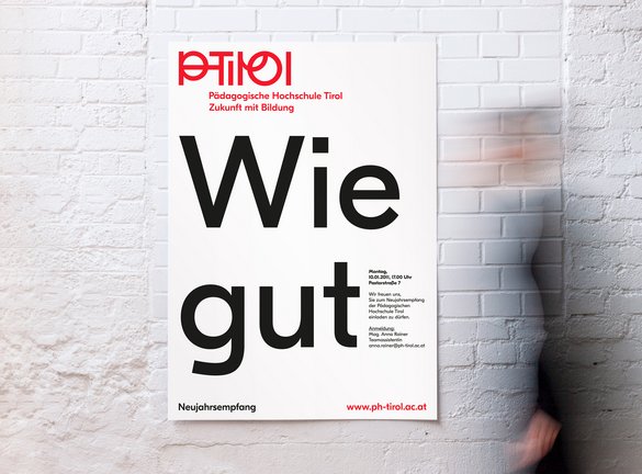
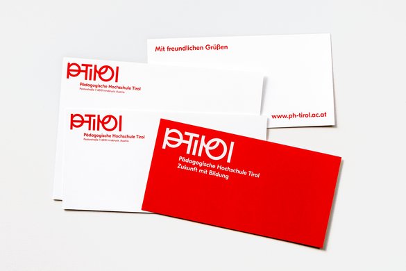
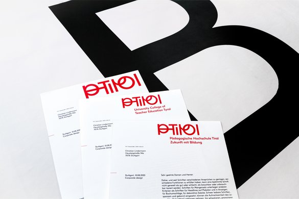
the logo for this teacher training college is a manifestation of the institution’s soul: the shaping and arrangement of the letters say something about how people come together there and relate to each other. each individual – each child, each teacher – has their own unique characteristics and quirks, expressed in the logo through the distinctive forms of the individual letters. the logo visualises these personal differences fitting together, aligning and connecting, guiding and supporting each other. the distinctive, idiosyncratic design makes it instantly recognisable. for specific applications, the PH TIROL logo can be further abbreviated to the acronym form PHT – the two letter images clearly referencing one another.
projectdata
place:
tyrol
year:
2021
client:
tyrol university college of teacher education
communication design:
büro uebele
visuelle kommunikation
project team:
carolin himmel
justyna sikora (project manager)
andreas uebele
photos:
justyna sikora
awards
tdc new york, tdc68 2022, certificate of typographic excellence