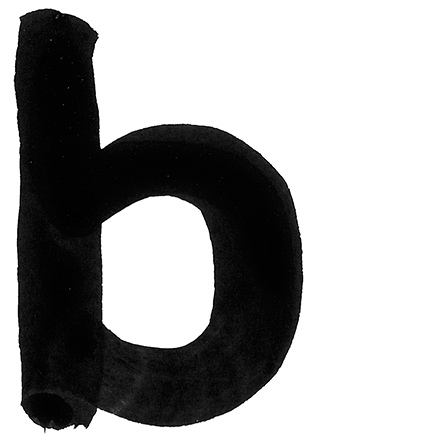
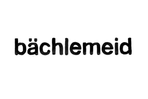
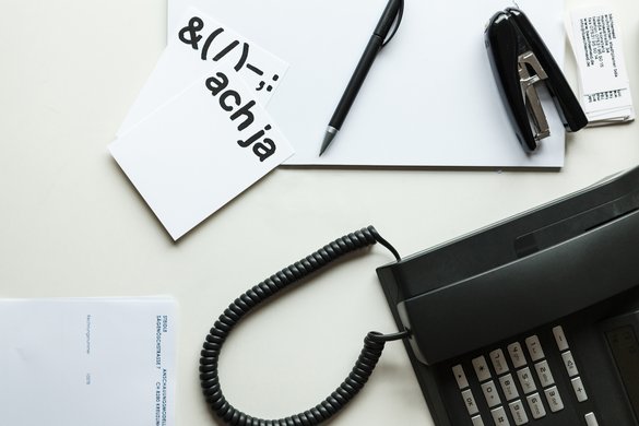
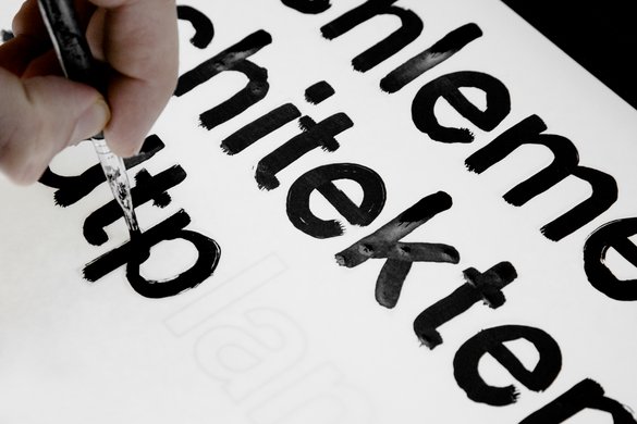
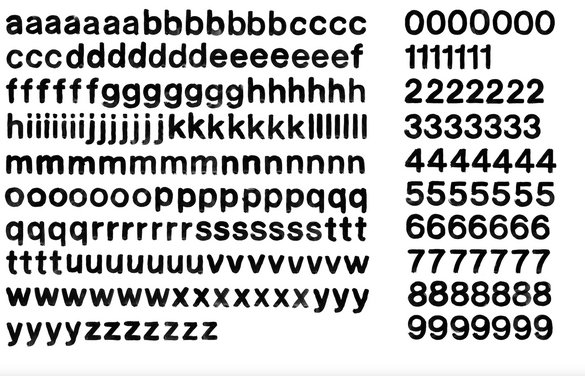
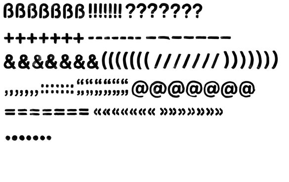
for their clients, these architects design buildings that are individual, »handmade« creations. and so from their graphic designer they receive an individual, handmade house typeface – a typeface so distinctive that they don’t need any additional image or word mark. the typeface used to set the company’s name and address was hand-drawn specially for the client. it communicates the unique personal element that design instills in the planning process. this literally unique alphabet captures – and releases – the essence of individuality through the flow of its hand-drawn lines, the transparency of the ink, the irregularities that naturally arise in the handmade.
projectdata
type design
year:
2020