New Projects


following the script
view:
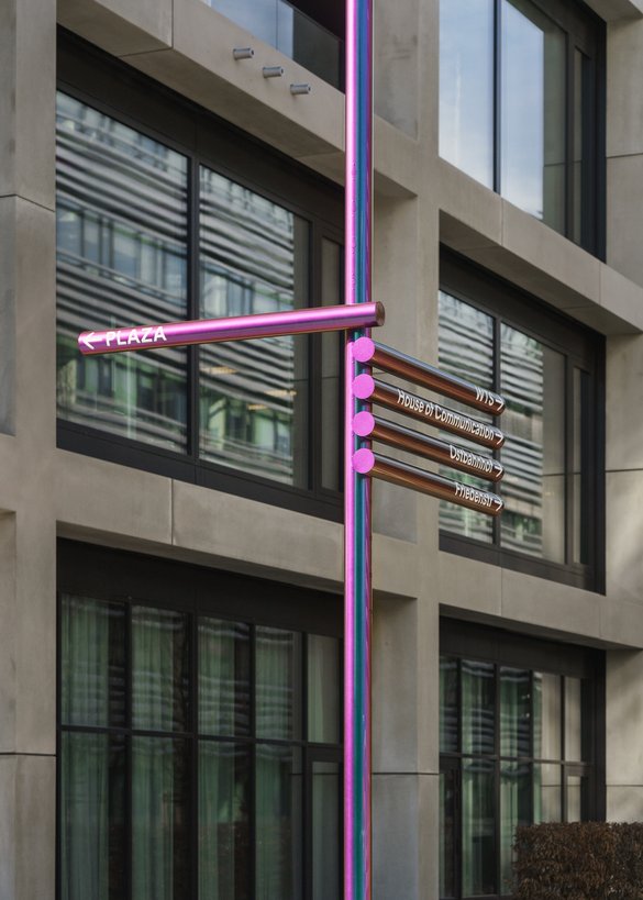
wüstenrot & württembergische campus, signage system, second construction phase


non nobis vol 2
the beautiful form is our contribution when it comes to confronting the ugly.
view:


Miscellaneous
animals of course!
counter-print includes two of our logos in their animal collection of the publication "animal logo, vol. 1".
view:

23rd place! ?
we are excited to be listed in page magazine's creative ranking this year! here: our contribution on the topic »tomorrow is better«.

tokyo tdc
tokyo tdc deemed the visual identity for stollarchitekten and the signage systems for serviceplan house of communication and waldmeisterstraße primary school as "excellent work".
view:
stollarchitekten, visual identity

nothing is irrelevant
eins muss zum anderen kommen, alles kann entscheidend sein.
view:

hugo-häring award for the baden-württemberg wind music centre
the jury praised the presence of the large graphics in the building, which add an additional voice and combine with the architecture in a very unique way.
view:

segd global design awards
the signage system for the serviceplan house of communication receives the honor award from the segd global design awards.
view:

non nobis in china
until 17 september 2023, the first book of the series "non nobis – über das bauen in der zukunft" will be exhibited by tokyo tdc in hangzhou.
view:

az awards
at the az awards 2023, the signage system for the serviceplan house of communication was named winner and people's choice in the experientail graphic design category.
view:

adc germany
the signage system for the serviceplan house of communication was awarded silver and bronze twice by the art directors club germany.
view:

european design awards
the signage system for the serviceplan house of communication was awarded silver at the european design awards.
view:
Blog

fast eine kunst
ein wort auf einem haus in wien erinnert uns wieder einmal daran, doch bitte ganz entspannt im hier und jetzt zu leben (lokkaisi). es spielt keine rolle, dass die schöne beschriftung nur für das gleeichnamige österreichische presseerzeugnis wirbt (zitat: Mama und Tochter: »Unsere neuen Brüste lieben wir«) – wobei, wäre es nicht schöner: wir lieben unsere neuen brüste? ach egal, schrift im raum lieben wir.

there is beauty in the broken. without the fragile and the courage, risking to create something bad, there is no beauty without destruction.
photo:
robi wache

in the streets of hanoi posters are hanging like newspapers on the wall. there you can read opinions about the city and quotes of goethe, which can be interpreted as comments about hanoi. these posters were made during a workshop with andreas uebele, organized by the goethe institut hanoi.

so muss es sein! glückliche gesichter bei der urkundenvergabe. die zeremonie wurde erstmals an der hochschule düsseldorf vollzogen? nein, gefeiert! mit der hilfe der boy group raoul gottschling und tobias hönow und der jury mit saskia diez und florian lamm und jakob kirch und peter ippolito von ippolitofleitzgroup. wir gestalten identitäten für andere. gestern haben wir auch identität hergestellt, und zwar für unseren fachbereich. kleine persönliche freude: meine ex-tutorin katrin gruszczyk bekommt für ihre von mareike föcking und mir betreute arbeit (manifest xenofeminismus) einen der designpreise der hochschule düsseldorf, den wir bei dieser gelegenheit auch gleich ins leben gerufen haben. eröffnet wurde die veranstaltung mit einem eigens für diesen anlass geschrieben vortrag von dem philosophen prof. hannes böhringer aus berlin.


10:09
spiegelbild
der spiegel wirft das bild zurück und stößt den betracher vor den kopf. er zwingt ihn, das zu betrachten, was er kennt. der blick geht nicht weiter, man sieht bekanntes. wenn man den standpunkt ändert, wird das bild, das entsteht, ein anderes. das körperliche löst sich auf, wird verrätselt. ein trick, eine optische täuschung, die im raum eine schöne wirkung erzeugt. jetzt sieht man das, was nicht in der blickachse liegt. ein spiegelndes schild ist wie ein parfüm. es überlagert die wahrnehmung und bereichert sie mit einem anderen visuellen eindruck.

15:36
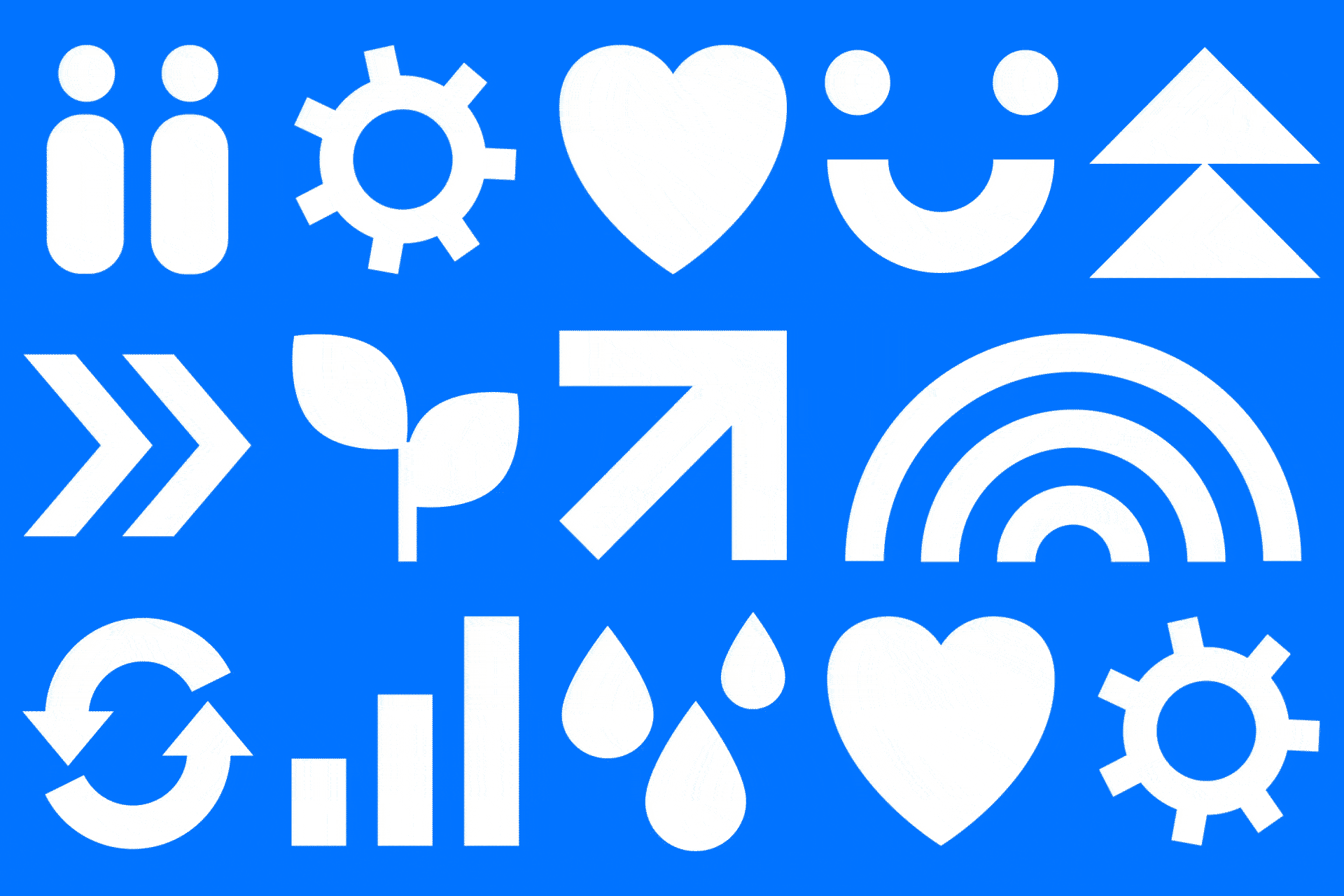
woman, man
a woman and a man. standing calm and still, wearing a knee-length dress and shorts. no specific fashion is discernible. these two figures have fallen out of time. yet they aren’t hermaphrodites – who’ve always missed out when the sexual categories are defined: we can see from the two figures that the man is probably a boy, the woman probably a girl. it’s not just that they’re almost exactly the same height: the female figure’s undeveloped chest, the shorts – which tend to be the preserve of the young – are sympathetic references to the un-sexual. a shared naïveté – or perhaps rather a shared innocence – overlays the stark division of the sexes. the form fulfils its function and reminds us of childhood. the figures aid wayfinding and tell us a tale of rediscovering a lost age.
picture language
someone who is looking for the toilet comes to a door. he sees what we might call a humanoid figure. he sees a person. the body descends vertically from broad shoulders, the legs stand parallel with a small gap between them. aha, the viewer says to himself, this is the place for men. yet if the figure has a waist and wears a skirt-like garment it is equally clear – at least in the western world – that we have reached the ladies’ toilet. the fact that this information is understood globally is a tremendous cultural achievement – its importance cannot be overestimated. it is the translation of instructions, place descriptions or complex emotional states into an internationally comprehensible language – basically the invention of an autonomous picture-based language that functions across all national boundaries. together, scientist otto neurath and graphic designer gerd arntz laid the foundations for the international visualisation system we use today, which helps us communicate various important matters quickly and straightforwardly without using writing and words. smileys, emojis and emoticons are another wonderful example of this. here you can see the beauty of gerd arntz’s original drawings: woman, man. smile.
11:38
plädoyer für die maßlosigkeit:
mehr ist mehr!
pracht, fülle und ausschweifung!

11:09
keep all
many designs are for the wastepaper basket. what a pity. but they are a good fertilizer for something new.